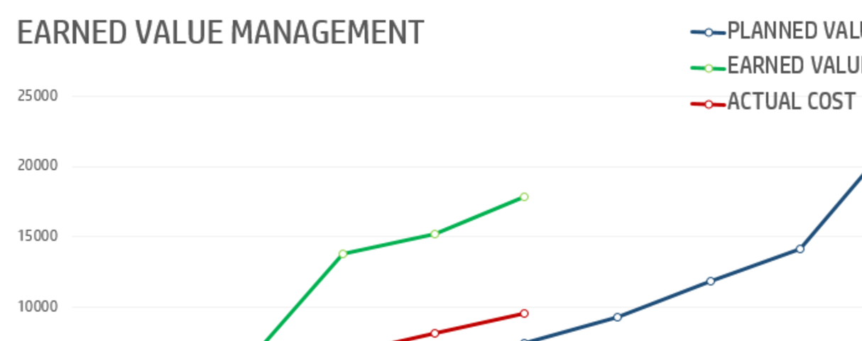
I've been recently undertaking my PMP exam for project management. A tricky topic is that of Earned Value and it's calculations. There have been various different spreadsheets that can be used, but these do not help when you want to practice for your PMP exam.
I wanted to practice more so I created a small test page where a question is asked in the form of a PMP practice test question, and you can enter the values to see if you worked it out correctly. So give it a go!
Let me know how you get on!

I'm amazed that people aren't all over display:flex; Still trying to center align images using table-cell, etc. So to help spread the Flexbox love. Check out the simplest example I can make to show you how it works.
There is no excuse not to use it. The support is great... and getting better with Safari removing prefixes. So check it out.
There has been a lot of hype about websites that build themselves recently and about how A.I. can will be able to do the job for you. Personally, I disagree.
I think neat tools labelled as intelligence is really just `design automated` or `content curation`. These layouts will look old pretty quickly if there isn't a real living breathing (non-coded) designer behind extending the designs.
Being around the CMS industry for some time now, I feel the best way is to build tools that take a `best guess` at a solution. This defends against the issues leading to Designing for the Unknown.
One of the problems I mention is about dealing with text over images. It's inherently hard without analysis on the image first. There is no point putting white text on a white image! And it shouldn't need the user to fiddle with the controls to get it right. My theory is, this part can be easily automated.
So that's why I created Imagenie. Imagenie is a Python script that will process an image's sentiment and delivers you back a whole load of data about that image. Using this analysis, you can build css to get the effect you need to deal with certain alignment, colour and contextual situations.
For example,
Imagenie delivers you this info. Check out the examples on the site. http://imagenie.it.
Forget A.I., the user / designer input is an important part of creating an organic, durable design to sit around your content. Think, instead, more about tools that can help bring us closer to a good result without much effort.
I gave a speech at the WDC 2014 about Designing for the Unknown; building themes when you do not know what content will be. I wanted to share a few point.
If you have built a site for someone else (client, family member with a business), then it is more than likely, you would not have all the content during the design phase. You would have essentially been Designing for the Unknown.
At BaseKit, this is a topic that we hold close to our hearts.
For those that don't know, BaseKit is online website builder. We’ve been live with our product for about 5 years. Currently we are running over 1.5 million websites worldwide. We have over 100 web hosting & telco providers using our software to offer a website building service to their customers.
There have been 2 major releases of BaseKit. Version 6 and Version 7 but there was a fundamental difference between to 2 versions.
V6 is a freeform tool that allowed you to drag and drop anything anywhere geared to Designers who want to use a visual editor over HTML. If you wanted your logo in your footer buried deep in the deeps of your content, you could. Within the the Editor we give you complete control of content, positioning and styling.
The V7 editor is completely different. It’s targeted at the small business owner that wants to get the online presence. All the templates are created by our template team and a user of the editor has limited control over style and layout. The product limits a user to adding content to one section of the page and templates are populated with data collected from the user; logo, company name, social links, etc. This allows the Template designer make all the right styling choices whilst the user can get on and add content easily in the confidence that it will always look great.
We (and other content management systems) have a unique design problem to solve; Every month, thousands for people build their sites on top of one of our templates. When we build themes, we need them to consider whole range of content, business types and cultures will be placing contenting into our editors. We need to build themes that look good with minimal content and that can organically grow as the site expands.
We are essentially designing for the unknown.
To help you visualise this problem. Think about your latest site design. Think about reusing it 10,000 times. You give it to 10,000 different people, of different cultures that want to use it in their various different ways. Their business; as a front of their online presence to their restaurant, or a blog template…. or to promote their plumbing service? How would your design fare?
Across our network we see 10,000s of sites created every single month. Themes that we create get repurposed literally 1,000’s times. The range of content we see generated from users in profound. With a wide variety of content; sizes, shapes, languages.
When we are designing themes, we have to consider that the range of content that could end up in it is endless.
As web designers we are obsessed with Content First. You’ve been in the situation where this where you feel you can’t continue with a design because of the lack of content. Which comes first! The design or the content?
YOU DON’T HAVE KNOW WHAT THE CONTENT WILL BE TO START THE DESIGN OF A SITE.
Thinking about the unknown will give you a lot of these benefits:
If you take these tips onboard, content will be less of an an issue. Whatever the client gives you, it will fit into the design. A design will be one with the content and grow into a beautiful, usable website.
I’m going to talk to you about images, text and a few bad design patterns that I think suck and we need to change. I’m also going to show you a few tools we use to help us solve certain design problems.
I've got a ton of demos to support this article, so check them out at healy.rocks
First things first. Let’s talk about the user
A good place to start is looking at what content the user brings to the table at various points at the project. The quantity and quality of the content varies through the site’s life.
The most basic assumption you can make with someone starting a website is, most likely, they are starting with minimal content. These days, we can’t say no content; they have Facebook pages, a load of photos, and a few scrappy pieces of text.
Ultimately:
So my first tip is, design with minimum content in mind.
You need to design your sites with minimum content in mind. The home page is a special case, by the end of project its usually pretty full but even that is hard to get the right content for. The internal pages of a site are usually the place that suffers from no thought to minimum content. Website designs NEED to work with minimal content. Especially for all of you out there looking at designs on your massive 27 inch iMacs. Nothing worse that seeing the footer floating in the middle of the screen.
And what is all with these one page designs?! You seriously have to wade your way through a theme marketplace before you find actually find non one-page design. It’s like they’re breeding!
There’s one thing that annoys me about one-page designs, is that they look amazing with a load of content but bad with minimum content. This is a prime example of a Designer running away with themselves with a design without any real thought of how it will be used in the wild.
Loads of times you see Designers making up content so they can fill the `content holes` properly to get that awesome gauge / animated graph working in the theme they’ve bought.
The way that Designers are using Lorem ipsum is an anti-pattern. It doesn’t represent real life content. What Lorem Ipsum ends up being is a tool that lulls you into a false sense of design security. When you try and put real content in its place and the design breaks or becomes uneven. We've seen designers try and manipulate the content to match you design, making sure theres the exact amount of lines of text in each column so that they line up properly!
Get out of that mind set. It sucks. As you all know, customers find it hard to write text, full stop. If you’re going to use Lorem Ipsum, vary the length of the amount of lines that you use; because this represents real life.
And try stop relying on Lorem Ipsum so much. This practice is futile because it promotes using content to strengthen a design, when we should be designing to strengthen the content.
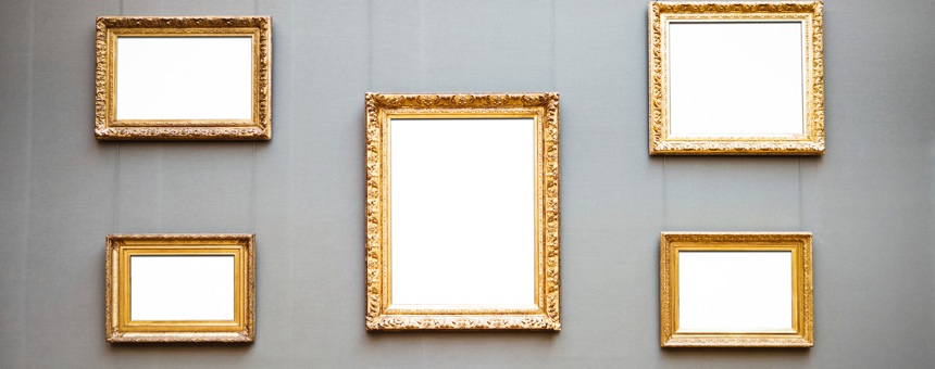
With nearly 2 billion photos taken a day worldwide, underexposed images with people blinking are here to stay. There’s no substitute for good imagery but it’s really rare to come by.
We use a little trick to make bad images look better. Transparent overlays. It dims the effect of bad looking images and makes them more of a background pattern / texture. Placing text over these makes the images look awesome too (see slides for examples).
Of the 4 million images we’ve had uploaded to BaseKit here:
Consider in your design. For example, when making your gallery layouts that show the images in a square format. Doing so will mean that you will most likely be cropping 90% of the images uploaded. Instead opt in for a layout that promotes the landscape image.
Looking at a thin slice of logo data from BaseKit database:
So the chances of a logo wider than 500px, higher than 250px or include text is a staggering 82%
Therefore if you want a create a header to cater for most logos, place the logo in the middle of the header with a fair amount of space around it. No need to include the company name as text as a wide proportion of logos come with them as part of it. And for those don’t, it can fit nicely under the centralised logo.
Navigation is always contentious. Because it can ruin everything! It starts off small with is always awkward to position initially, then as it grows… its original position usually isn’t fitting anymore… so it should be moved. How can you design for the organic growth of nav?
If your answer is Folders then you are Wrong!
Our research indicates that users tend to hate folders for sites under 10+ pages. There mostly top level pages.
To cater for most logos, most site name strings and navigation you need to create a layout like so:
As most of the content is centralised, then it doesn't matter for the text and imagery within the logo is aligned differently or if you have a lot of navigation or hardly any, the content within this layout configuration will always look good.
If we stuck to this one layout, then every design would look the same, right? Surely there must be a way that content can configure itself into a better layout based on the what the user provides. At BaseKit, we've been experimenting with some amazing technologies. Mainly Flexbox and elementQuery.js to achieve dynamic configurations.
Awesome Header Layout Demo - in your Browser's Developer tool, change image sizes, title length and navigation element amounts to see the affect.
In the above demo, every time the content changes, the layout responds to organise the content into a better configuration. Setting minimum widths on the logo, site title and navigation makes use of Flexbox's drop-and-organise layout (a basic demo lives here - resize the screen and see the theory in action). Also, elementQuery.js helps align the site title when it's container gets bigger than 768px. Cool! As this is not a Flexbox or elementQuery article, I skip the details, but check out the links to find out more!
If you want see my slides from the WDC, I've placed my slides up on Slideshare.
I've always been interested in seeing what mileage we can get out of the BaseKit gallery widget utilising different layouts. One of the major issues I’ve found with user content, specifically images, it’s hard to know how to deal with variations in size, length and orientation.
A one-size-fits-all layout is hard to achieve when you are dealing with portrait and landscape images; especially if you want to maximise the viewing platform range.
In this post I explore the various different layouts and libraries you can use to obtain spatial perfection.
See the 3 different ways to style the BaseKit gallery widget post on the BaseKit developers blog.